Radiator Covers
We are Ireland's top rated manufacturers of bespoke radiator covers. Get delivery or click and collect! Get a QuoteOr Scroll to Products
Get a Quote
Fill out the form below and we will get back to you within a day (Monday-Friday).
100% Made to Measure
Stunning designs that suit a modern minimalist style, classic design or chic country decor.
Available in Any Colour
We only use the highest quality materials and spray paint with custom colours at request.
Nationwide Delivery
We offer a delivery service or collection from our workshop (Mon-Fri 8am – 5pm).
-

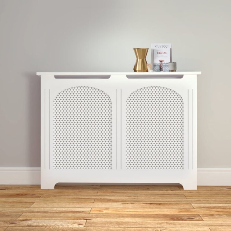
Traditional Radiator Cover 1
€189 -
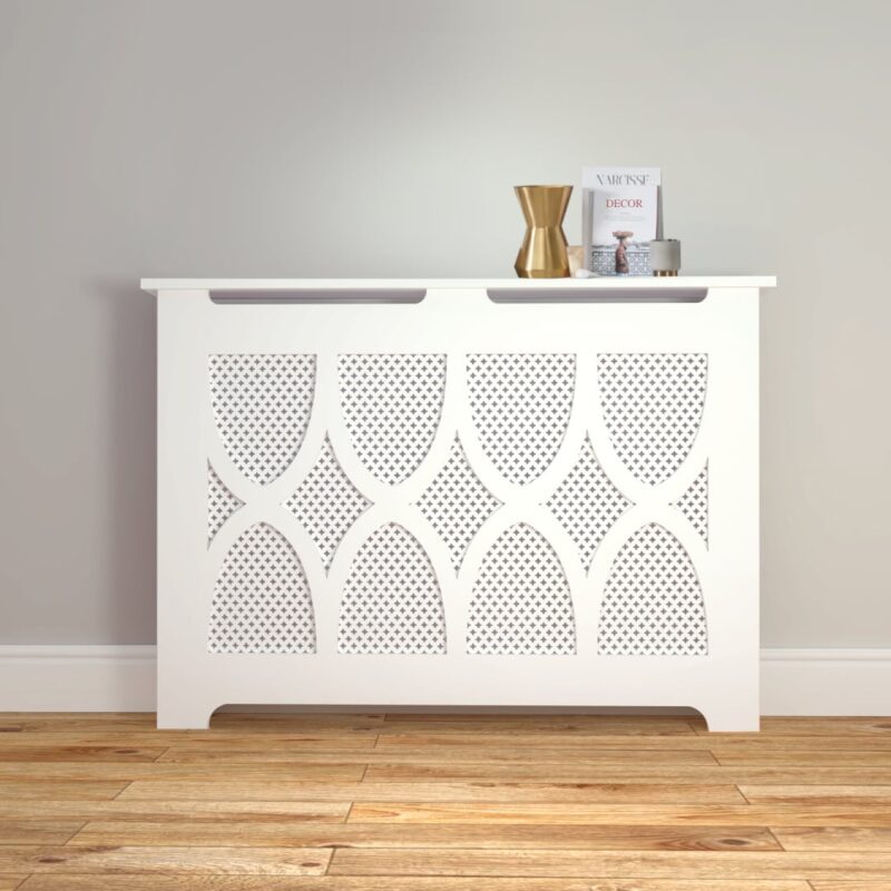
Traditional Radiator Cover 2
€215 -
Traditional Radiator Cover 3
€215 -
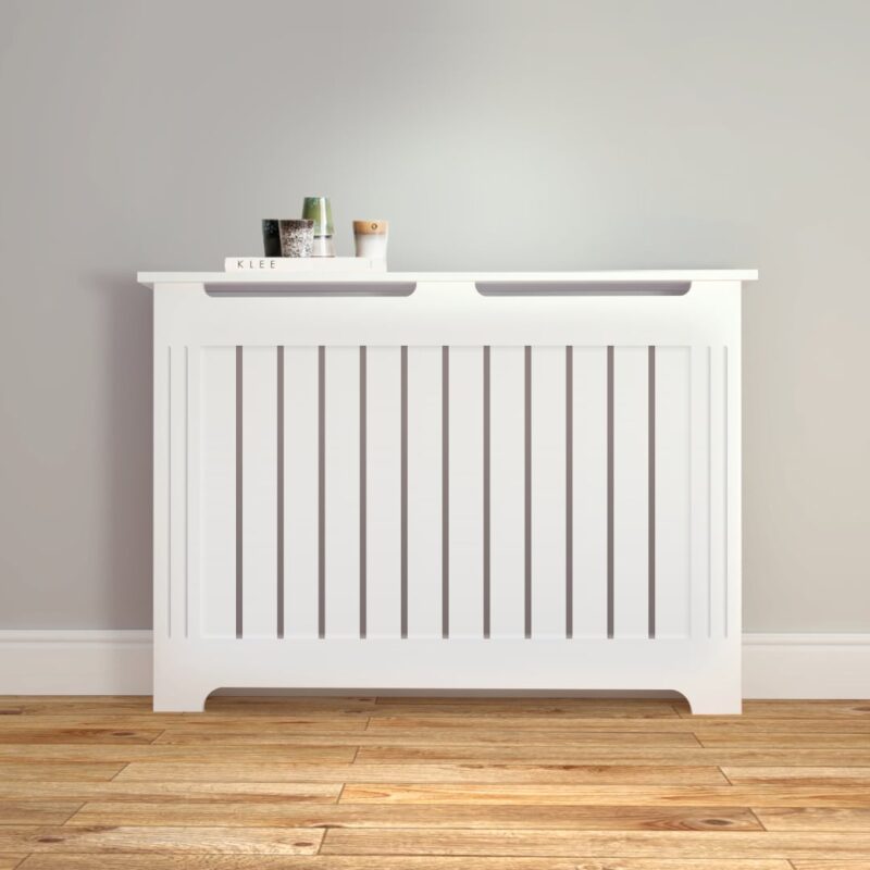
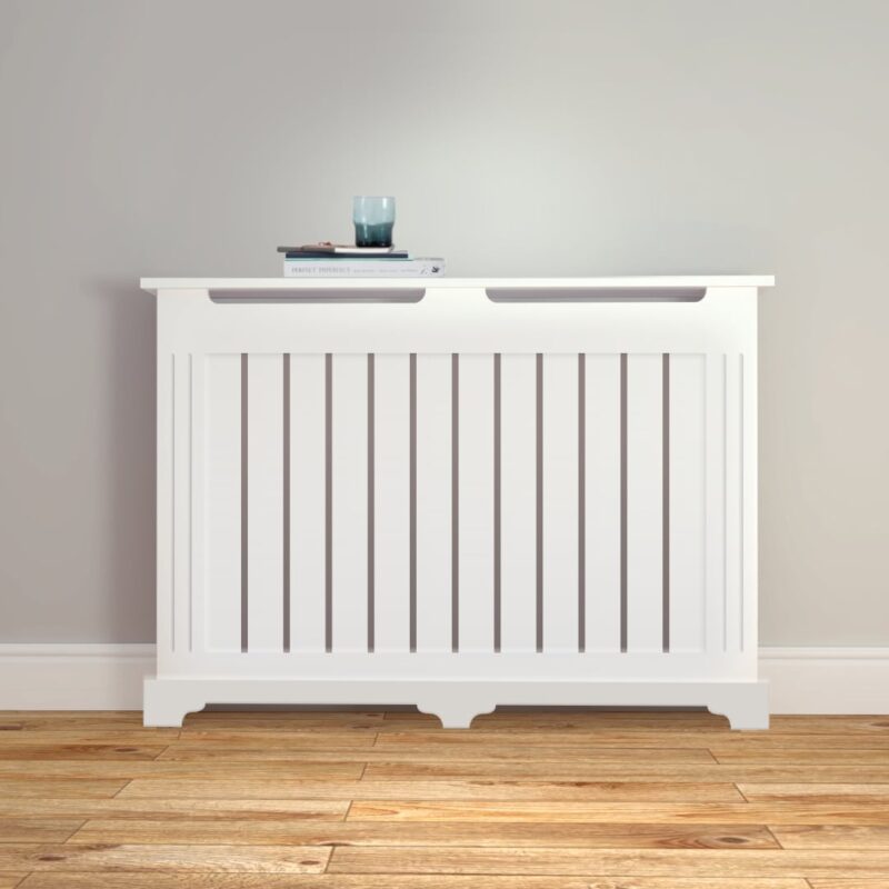
Stylish Radiator Cover 1
€215 -
Stylish Radiator Cover 2
€215 -
Stylish Radiator Cover 3
€215 -
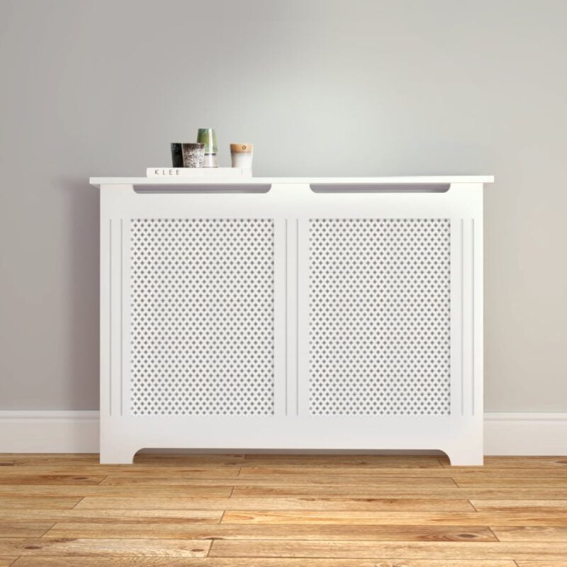
Classic Radiator Cover
€225 -
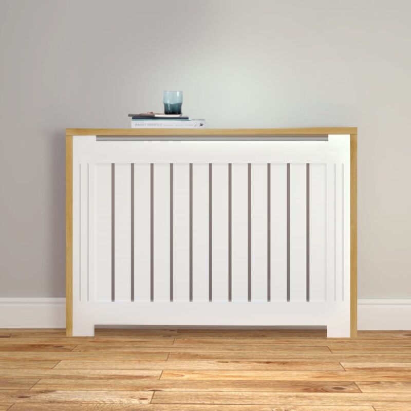
Oak Frame Radiator Cover
€275 -
Oak Top Radiator Cabinet
€325 -
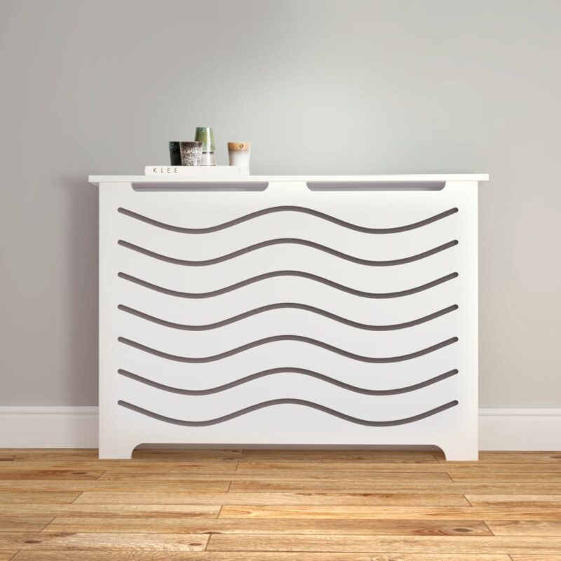
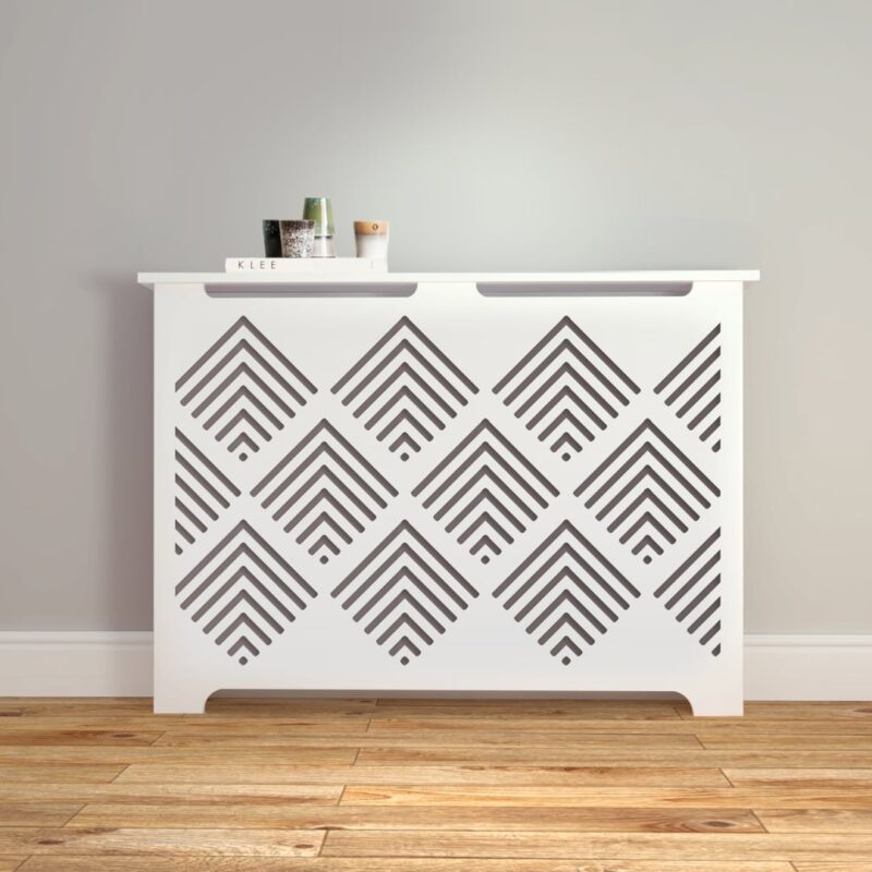
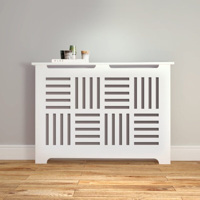
Contemporary Rad Cover 1
€215 -
Contemporary Rad Cover 2
€215 -
Contemporary Rad Cover 3
€215 -
Handleless Radiator Cabinet
€325 -
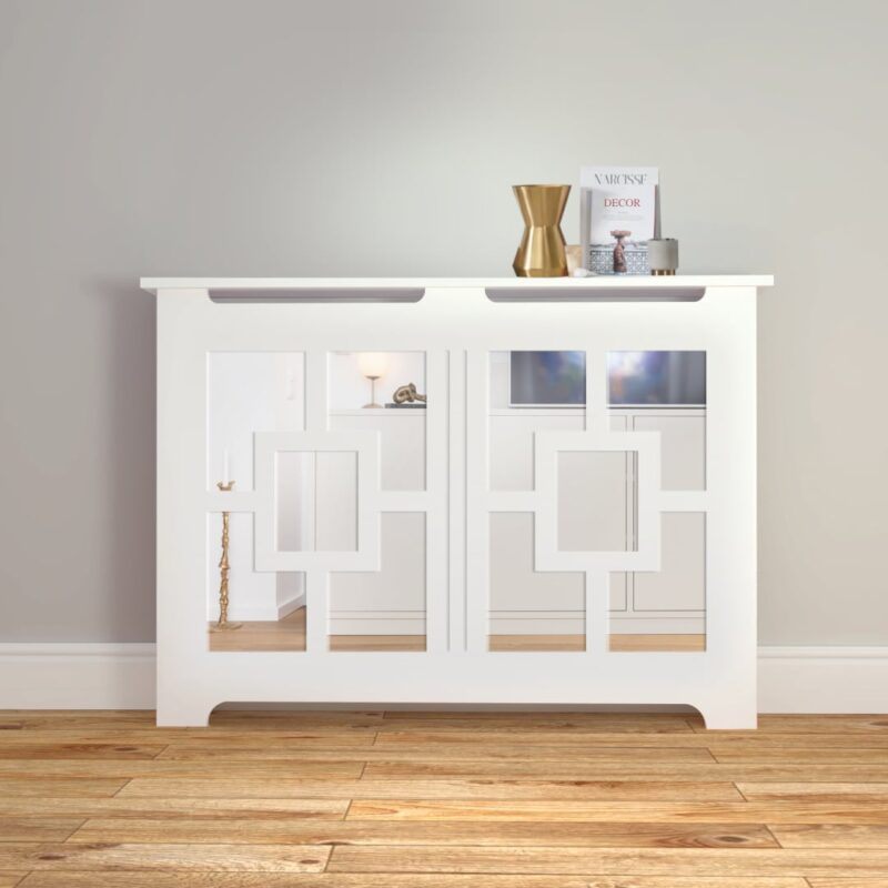
Classic Mirror Rad Cover
€395 -
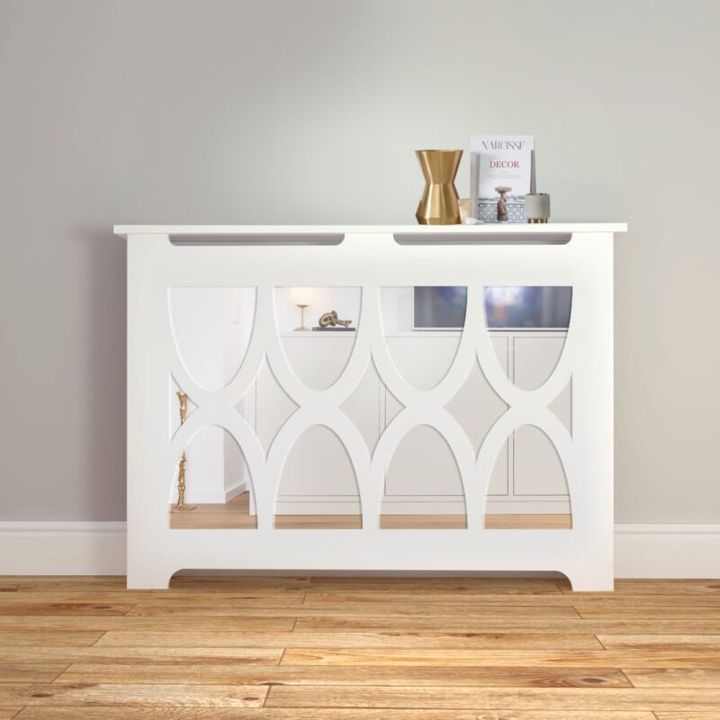
Stylish Mirror Rad Cover
€395 -
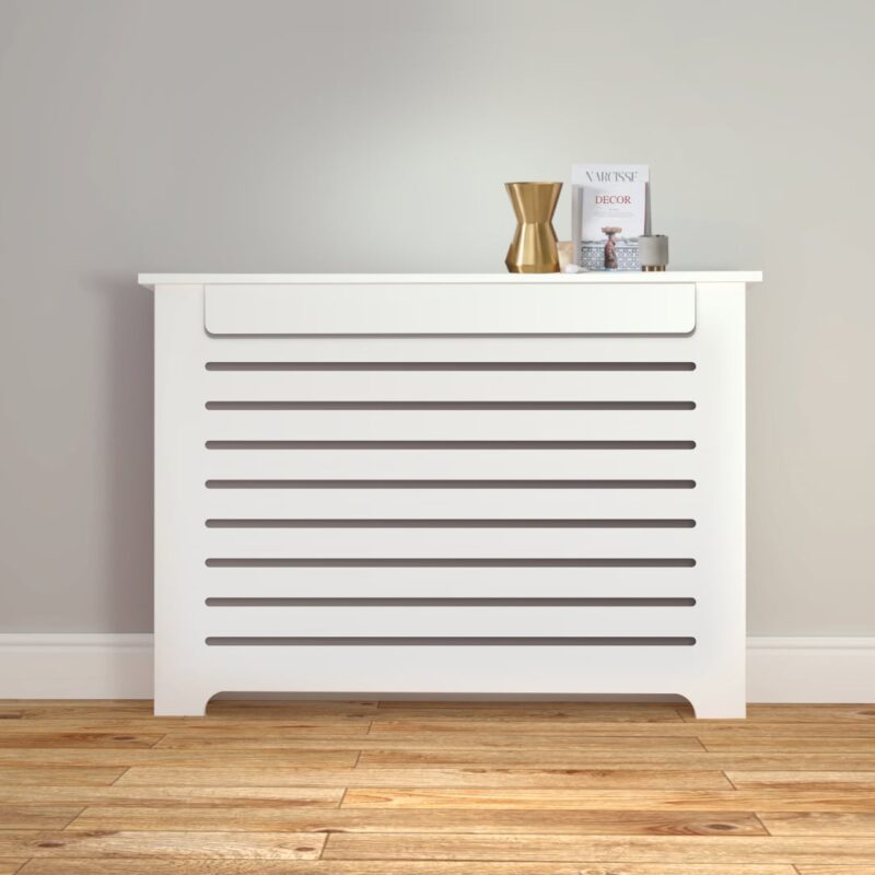
Radiator Cover M
€205 -
Radiator Cover N
€195 -
Radiator Cover O
€195 -
Rad Cover Style F
€195 -
Rad Cover Style G
€195 -
Rad Cover Style H
€215


Best Quality & Value in Ireland!
Absolutely stunning bespoke covers. There is a lovely bit of weight in them, not like the shop bought ones. Miriam was a pleasure to deal with. I'm slowly getting them made one by one for the house and would not hesitate to recommend this company.
My new radiator cover was delivered last week and I am absolutely delighted with it. It is beautiful. The cover is of excellent quality and the workmanship is top class. I would highly recommend this company. I dealt with Miriam and her level of service was exceptional!
I can't recommend RadCover.ie enough! They were by far the best priced company I enquired with and the service was brilliant. The cover was ready sooner than expected and when it arrived I was absolutely thrilled with it. Could not be happier!
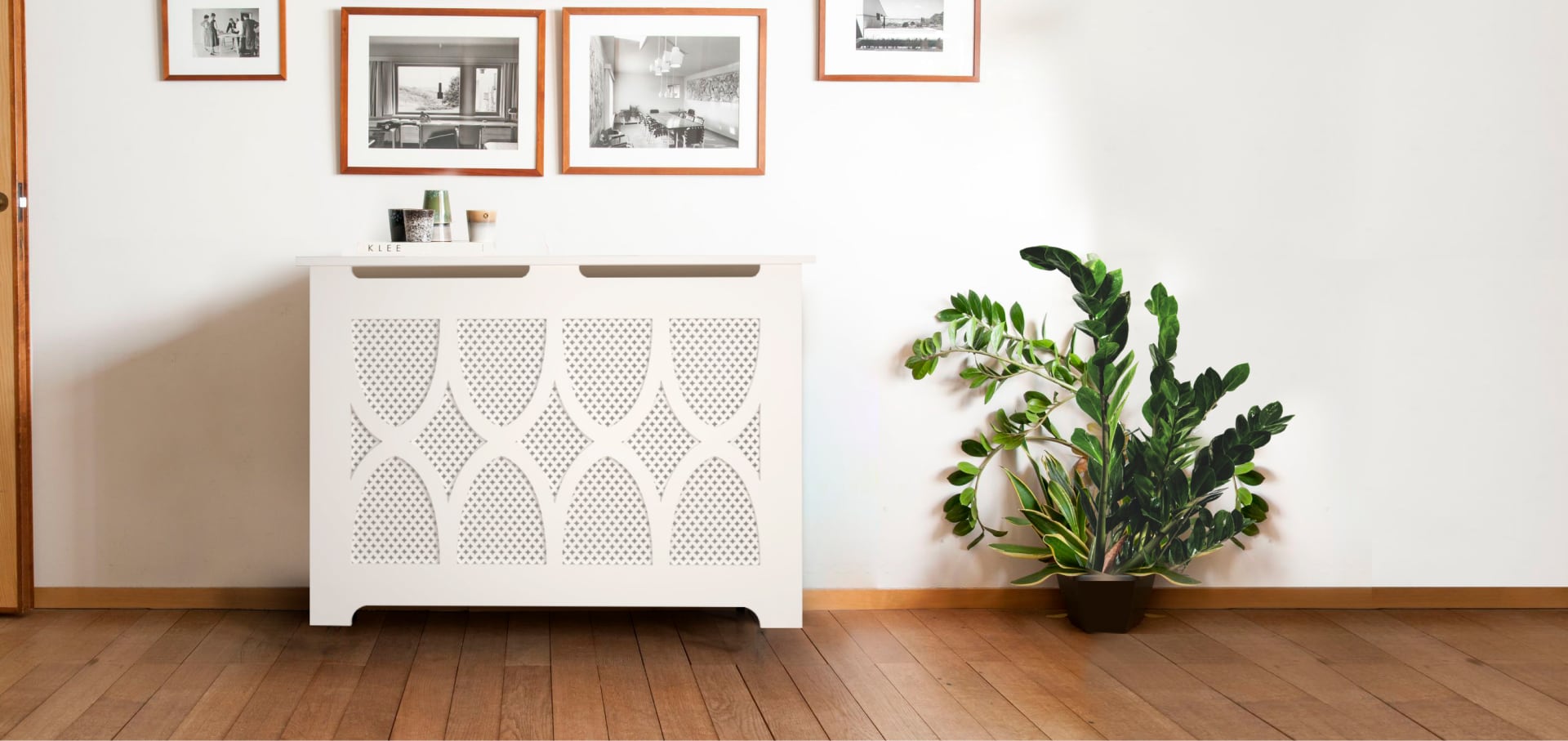
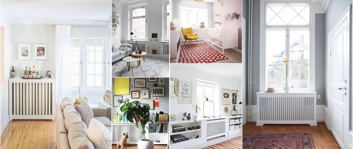
It is often the small details that help to make your home more comfortable.
Radiator covers are a great way to add more character to any room. Our made-to-measure covers are available in a range of styles and colours — and we are sure to have the perfect design for you!
Radiators are a necessity within the modern, central heated home but can often be unsightly.
We design and manufacture all our products using high-quality, moisture resistant MDF at our warehouse in Dublin.
Finished in PU paint, usually in a tasteful off-white but also available in a colour of your choice upon request, these covers are the perfect addition to your house and a way to compliment the style of any room.
Radiators are essential in every home, but they aren’t usually the most attractive of items.
As an interior design element, they can pose a challenge to incorporate into a theme which can affect your chosen design.
One option is to replace the radiators with new ones that match your ideas, but this can be costly and you will usually need a plumber to install them. It can also be hard to find the right model in all the sizes that you need.
Choosing to fit radiator covers is a much easier alternative and helps you make an impactful, yet cost-effective change. Our covers can instantly transform a plain radiator into a thing of beauty.
Available in a range of styles and colours, you are sure to find a rad cover that will blend effortlessly into your chosen room design.
As well as supplying standard rad cover sizes, we also design and manufacture bespoke products that fit perfectly into your home. So if you find yourself browsing, get in touch with our team for an initial quote.
Radiator Covers
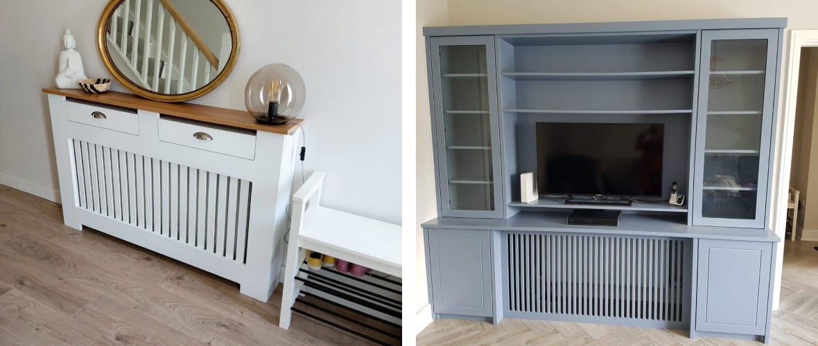
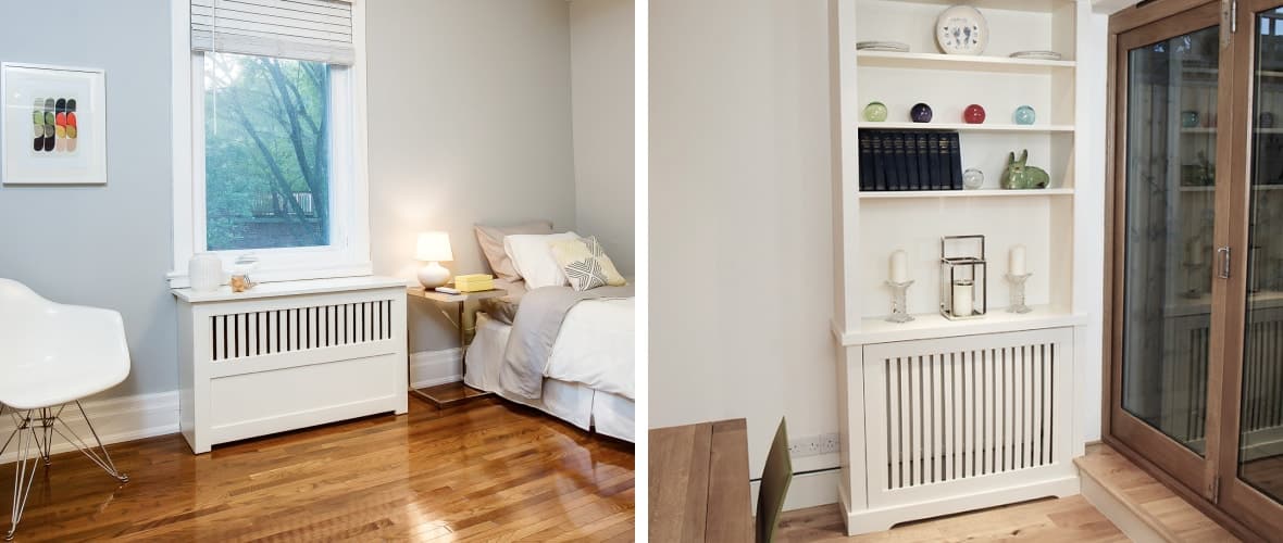
A further reason you may choose to order radiator covers is the functional purpose they add. Often the position of radiators can create wasted space. By choosing to conceal them, you are also able to add a shelf space in your room.
In the past we have manufactured radiator covers which incorporate larger units which can be used as cabinets or bookshelves. Our team loves a challenge so get in touch if you have any specific design requests.
Alongside the design and functionality benefits, there is also a safety benefit. Covering a radiator will ensure younger children are protected from the heat and prevent any accidental injuries from touching the hot elements underneath or slipping into it.
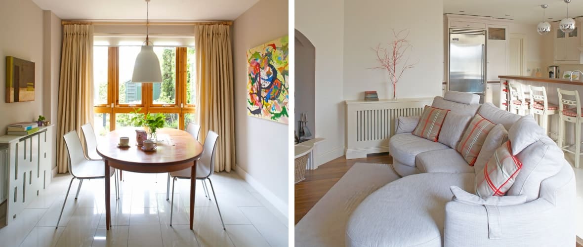
When considering redecorating a room within your home, it is important to seek inspiration and create a picture of what you would like the finished room to be. For those of you who prefer a traditional inspired style, you may want to include wall panelling.
While it is often considered to be a traditional element of interior design you are able to order wall panelling with a few modern design twists. This — coupled with one or two stylish radiator covers — would help to create a refined design statement!
Made to Measure Radiator Covers in Ireland
While we manufacture and produce a standard size range, we also offer bespoke radiator covers to provide the perfect fit.
These rad covers are particularly useful if you are incorporating a vintage of unusual interior design pieces into your home. Opting for a made-to-measure piece ensures that you can add a nice touch to these essential items in every room of your home.
For those hard to reach heaters in alcoves or corners of your home which often prove difficult to incorporate into the chosen styling of your room, we can radiator covers in our full range of styles, and finishes made exactly for the space that you have at your disposal.
Every radiator in every room in every home can be uplifted and made stunning with one of our made-to-measure products.
A further benefit of buying from us is the ability to create a perfect snug fit while still allows for optimum airflow and increasing the effectiveness of your heating system.
Building your radiator cover to the exact measurement means that there is no wasted space. Perfect for smaller rooms!
What are the advantages of radiator covers?
Ordering from us with your measurements is more affordable than you would think — especially for a bespoke product. If you want to create a common theme throughout your home, we suggest choosing the same style rad covers to fit throughout your home.
If you want to do something a bit unique, why not try choosing the same style in a different finish to compliment the colour scheme of each room.
We can also produce made-to-measure cabinets which are extremely stylish and practical. You can also get one which combines storage (such as a bookshelf) or TV cabinet is a unique and innovative way to hide your radiators and ensure your home looks great.
The process is quick and simple from your initial enquiry to the radiator covers being delivered to your home.
1. You make an enquiry
If you just want a quote you can use our contact form to send us your requirements and we will be more than happy to send you a quote for the perfect radiator cover.
If you have found your desired style and know exactly what you want, you can place your order directly online by inputting your measurements directly onto the page of your chosen style.
2. We send you a quote (unless you ordered directly online)
One of the team will email you a quote based on the style that you like and the size of your radiators.
Before we start making your covers, we will send you final external measurements for everything and we will ask you for details such as any space restrictions or whether you need a specific depth for a narrow hallway. This will ensure your covers fit perfectly when they arrive.
We will also ask for the height and thickness of your skirting board so that we can make a cutout for it on the sides.
3. Making your radiator covers
Once your measurements are confirmed, we will then begin manufacturing your bespoke radiator covers in our workshop.
The covers can be spray painted in white or finished in a custom colour, or we can leave them raw or primed if you plan to do it yourself.
4. Delivery (or collection)
Once your brand new pieces are ready, we will wrap them and organise a delivery date or we can hold them in our warehouse in Dublin for you to collect them. We offer nationwide delivery, and you can see the prices here.
5. Installation
Our products are made to measure and they come fully pre-assembled, so they are incredibly easy to fix to the wall. You can secure them to the wall with the small fittings we provide, it only takes a few seconds.
Radiator Covers Ireland
As a quality and trusted supplier of radiator covers in Ireland, we produce and deliver manu fantastic pieces to happy customers each week.
Choosing the perfect cover for the style of your home is important to ensure it compliments and works well with your interior design choices.
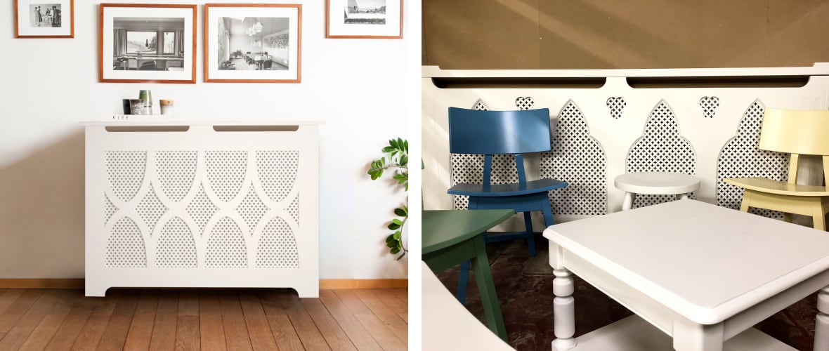
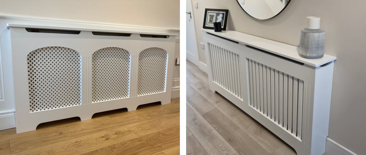
If you own a more traditional home, you can choose a timeless design with a lattice. This is the perfect choice to retain a sense of elegance and character.
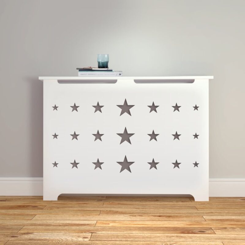
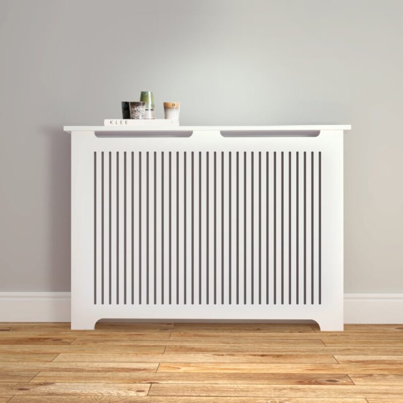
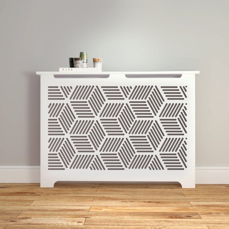
If your home boasts a modern design, we have a range of options available and you are sure to find something which can make a design statement. We have a variety of stylish patterns, so just have a look and tell us if you need any customisation.
There are some great ways to liven up your room. For larger units with a wider top, you could use them as you would a mantle piece. Why not adorn the top with photos of treasured memories and lucious green house plants?
You could also top it with a stylish mirror to finish it off and make this a focal point of your room or hallway. We can make them in any size you want, so no hallway is ever too narrow!
No matter where you are across the country, we can produce and deliver the rad cabinets in Ireland.
Rad Cover Prices
All of our radiator covers are competitively priced. Starting from €189, our radiator cover prices vary based on the size, design and finish you opt for.
Our radiator covers are designed to maximise airflow and prevent heat loss, so that heating your home will not cost you more just because of them. Our styles feature cutouts that allow the warm air to circulate from your radiator to your room, and keep your heating system working at its best.
Covering your radiators is only recommended if your home heating works correctly and there are no faults. If your immersion heater is experiencing issues such as overheating or is causing your rads to lose heat too fast, we recommend you book an immersion heater repair which can be done while your new covers are being made.
Browse our product pages for more details or get in touch with one of the team for a personalised quote.
How to Measure the Covers
It is important when ordering radiator covers that you provide accurate measurements to ensure a great fit. That’s why we have provided a simple two step guide for how to measure the covers:
Width - Using a measuring tape, measure the radiator from left to right. Be sure to include the valves on both sides as you will want these to be hidden.
Height - Start from the floor and measure to just above the top of the radiator.
Rest assured that our team personally checks measurements you enter online, we all know how easy it is to slip another 0 by accident. We also add a little bit to each measurement to ensure that the heat can flow around the radiator and that everything will be covered and not too tight.
We will always double check your measurements and confirm everything, and for every order we will send you final measurements for every cover — both internally and externally.
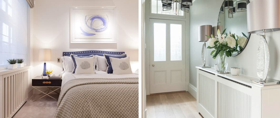
Bespoke Radiator Covers
The first thing people see when they step inside your home is the hallway — and it’s true what people say, you don’t get a second chance at a first impression.
Hallways in most homes usually lack individuality and can appear monotonous.
Choosing to add a radiator cover in your hallway provides an additional design element which breaks up the very basic layout of most hallways. Choosing a radiator cover with a bold pattern could really make it a feature within your hallway.
Furthermore, you could choose radiator cabinets instead of regular covers — which would not only make a design statement could double up as a storage space for keys, shoes and coats.
Inspiration
A radiator cover doesn’t don’t just look great — it can be functional too!
By a simple search on Pinterest or Instagram you can find some fantastic inspiration to help you plan the perfect way to incorporate this into your interior design.
There are so many ways to use our covers to enhance the style of a room. One simple way is to pair a minimalist cover finished in a slightly different tone to your wall colour to achieve a cohesive feel.
Alternatively you could choose a bold, bright colour in which to finish your cover to make an impressive design statement!
One interesting idea is to use radiator cabinets — which come with built-in drawers — in a small bathroom to give you a little extra storage. It’s a great way to spruce up the downstairs bathroom and hide the clutter.
One real wow factor design idea is to use it to make a window seat. This is a great way to make a book nook, and it can also be finished in a stylish colour and paired with cushions to look great in the downstairs living space or in a bedroom.
Radiator Cabinet Styles
Radiator cabinets made to measure
You will need a radiator cover that is made to measure if your valve positioning is substandard or your skirting is higher than normal. The width of the radiator cover can be adjusted to suit your living space. We can make a cover that has wide surface area or a slim cover in areas where free room is a necessity.
Custom made radiator covers
If you want to expand your storage you can install custom made cabinets and shelves around your radiator covers.
Small radiator covers
We offer covers in small sizes to suit areas with limited space like a bathroom. You can use the surface area for storing bathroom essentials or to keep your towels warm.
Extra large radiator covers
Large radiators can be sized and covered to blend them into your interior design.
Slimline or shallow radiator covers
Slimline radiator covers are perfect for minimalist and small households. It’s a stylish solution for masking a radiator. Hanging a mirror above the cover will visually expand a small living space.